Building a Brand from Scratch: The Terraverde Case Study
A behind-the-scenes look at how we developed a complete brand identity for Terraverde, an urban farming startup, from first conversation to final delivery.

When the founders of Terraverde walked into our studio last spring, they had a bold vision and almost nothing else. No logo, no color palette, no website — just a plan to build rooftop farms across New York City and a deep conviction that urban agriculture could reshape how cities feed themselves. Our job was to turn that conviction into a visual identity.
Discovery: Listening Before Designing
We spent the first two weeks not designing at all. Instead, we conducted workshops with the founding team, interviewed potential customers at farmers markets, and researched competitors in the urban agriculture space. What emerged was a clear tension at the heart of the brand: Terraverde needed to feel both earthy and modern, both grassroots and credible enough to attract serious investment.
This tension became our creative brief. Rather than resolving it, we decided to let it drive the design.
The Mark
The logomark went through forty-seven iterations. Early explorations leaned heavily on leaf and plant imagery, but every version felt generic. The breakthrough came when we stopped thinking about farming and started thinking about architecture. The final mark is a geometric abstraction of a rooftop greenhouse — clean lines that suggest both structure and growth. At small sizes, it reads as a simple, confident shape. At larger sizes, the layered forms reveal depth and dimension.
We paired the mark with a custom-modified typeface based on General Sans, adjusting the letter spacing and rounding select terminals to soften its geometry without sacrificing legibility.
Color and Material
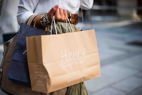
The palette was deliberately restrained: a deep forest green, warm terracotta, off-white, and charcoal. We wanted colors that could live on a tote bag at a farmers market and on a pitch deck in a boardroom. The terracotta became the hero — unexpected enough to stand out, warm enough to feel inviting, and distinct enough to own in the category.
For physical applications, we specified uncoated paper stocks and soy-based inks. The brand had to feel like something you would want to touch.
System Thinking
A logo is not a brand. A brand is a system. We delivered Terraverde a comprehensive toolkit: business cards, packaging templates for produce boxes, social media frameworks, signage specifications for the farms themselves, and a detailed brand guidelines document. Every element was designed to work independently while reinforcing the whole.
The Result
Six months after launch, Terraverde's brand recognition in their target neighborhoods exceeded their projections by forty percent. More importantly, the founders told us something that mattered more than any metric: people trusted them faster. The design did not just look good — it communicated competence, care, and credibility before a single word was spoken.
That is what brand building is really about. Not decoration. Communication.