Color Theory Meets Modern Branding
From dopamine palettes to strategic neutrals — a deep dive into how color trends are reshaping brand identity in 2025 and beyond.

Color is the fastest communicator in design. Before a viewer reads a single word or processes a shape, color has already set the emotional stage. In branding, this makes color selection one of the most consequential decisions a studio can make — and one of the most misunderstood.
The Post-Minimalism Color Landscape
For the better part of a decade, branding was dominated by flat, desaturated palettes. Startups gravitated toward soft pastels and generous white space, creating a visual landscape where everyone looked like everyone else. That era is ending.
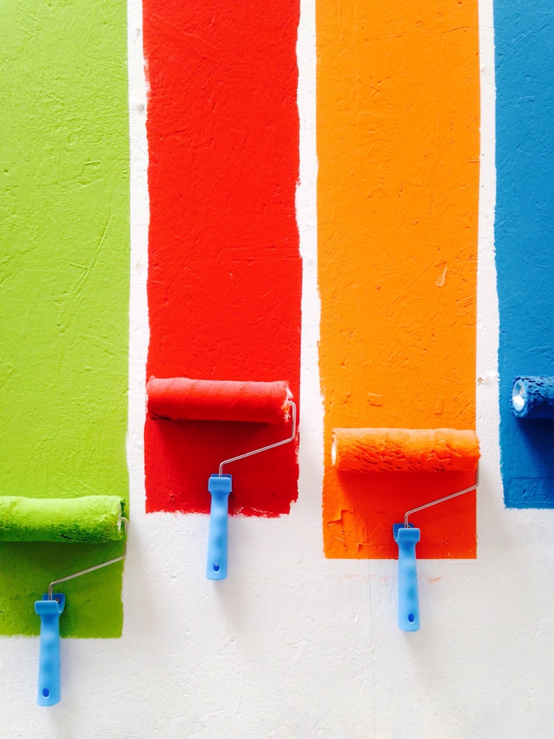
What we are seeing now is a bifurcation. On one side, brands are embracing what some call "dopamine color" — saturated, high-contrast palettes that demand attention. Think electric violet against citrus orange, or deep teal paired with hot coral. These palettes reject subtlety in favor of energy, and they work particularly well for brands targeting younger audiences who have grown up in a visually noisy digital environment.
On the other side, a more sophisticated neutrality is emerging. Not the flat grays of minimalism, but rich, nuanced earth tones — terracotta, olive, ochre, slate — that carry warmth and texture. These palettes feel grounded and intentional, and they signal a brand that values substance over spectacle.
Context Is Everything
At Fireflies Collective, we resist the idea that any color trend is universally applicable. A color palette must emerge from the intersection of brand narrative, audience psychology, and cultural context.
Consider how color meaning shifts across cultures. White signals purity in Western markets but mourning in parts of East Asia. Red conveys urgency in the United States but prosperity in China. For brands operating across borders, these nuances are not academic — they are strategic.
We recently worked with a specialty coffee roaster expanding from Brooklyn into Tokyo and Seoul. Their original palette — warm cream and deep espresso brown — translated well emotionally, but we adjusted the accent color from a Western-coded burnt orange to a deeper persimmon that resonated more naturally in East Asian visual culture. Small shift, significant impact.
Building a Palette That Lasts
Trend-chasing is the enemy of durable branding. The best color systems are built on three principles:
- Anchor with intent. Choose one or two core colors that embody the brand's emotional center. These should feel inevitable, not fashionable.
- Build a flexible system. A core palette needs supporting players — secondary tones, tints, and neutrals that allow the brand to flex across contexts without losing coherence.
- Test in the wild. Colors behave differently on screen, in print, on packaging, and in environmental design. A palette that sings on Instagram may fall flat on a storefront. We prototype across media before finalizing any system.
Color is never just decoration. It is the first promise a brand makes to its audience. Make it count.